Case study · Accessible gamification
Campus Explorer: a game-like course everyone can play
A government-supported provincial post-secondary planning service wanted high school students to discover what its website could do for them. I turned the site into an illustrated campus to explore, with six buildings, twelve badges and hands-on activities, then made every part of it work by keyboard and screen reader.
- Client
- Government-supported provincial post-secondary planning service
- Audience
- High school students planning for post-secondary
- Format
- Storyline 360, six explorable buildings with activities and badges
- My role
- Instructional design, illustration, Storyline development, accessibility QA
- Standards
- WCAG 2.2 AA, keyboard and NVDA tested
- Timeline
- About 3 months: 1 month of planning and storyboarding, 2 months of development and review
Client name withheld. The course shown here has client branding removed.
The brief
The client's website helps students search programs, plan their path and apply to post-secondary. The problem: students found the site confusing and weren't using it.
The audience was high school students: short on patience for a lecture about a website, and likely using it for the first time. The course had to feel like something they'd choose to explore, and it had to work for every student.
A game-like course is easy to make fun. The hard part is making it fun for everyone, including students who navigate by keyboard or listen with a screen reader.
Try it: explore one building
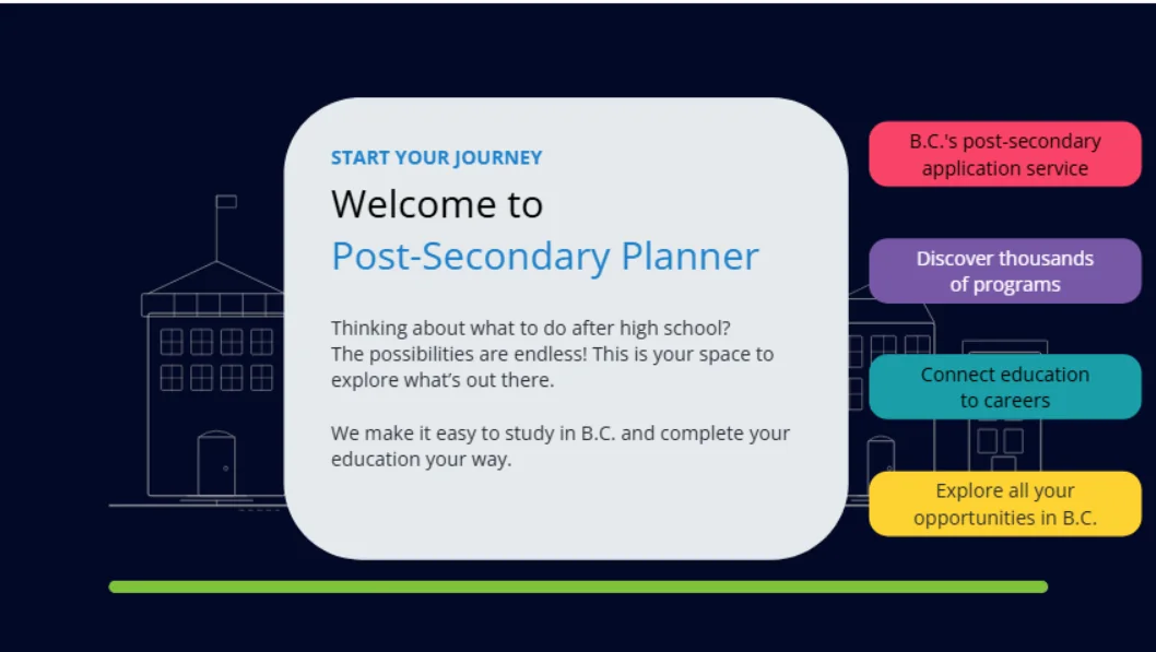
Here is the first building from the finished course, the Welcome Centre, published from Storyline. Try it with your mouse, then try it with only your keyboard: Tab to move, Enter or Space to select.
Design decisions
A campus, not a menu
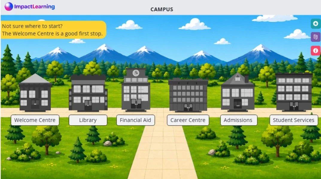
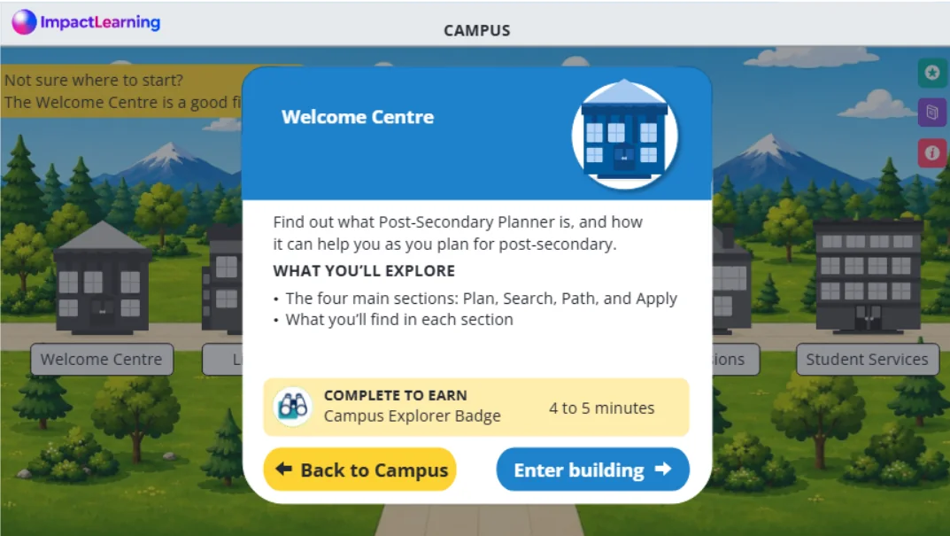
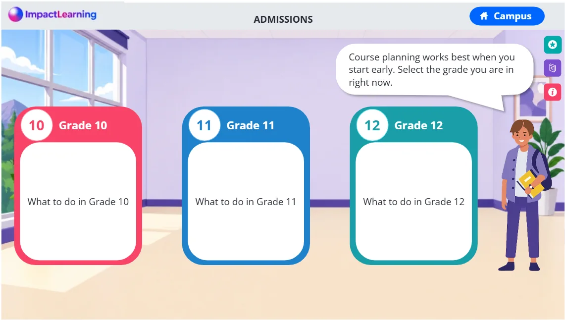
Each section of the client's website became a building students can visit: the Welcome Centre, Library, Financial Aid, Career Centre, Admissions and Student Services. Before entering, a card shows what they'll explore and roughly how long it takes, and the Welcome Centre is suggested as a first stop for anyone unsure where to start. Students choose their own route, but never get lost.
Badges that reward exploring
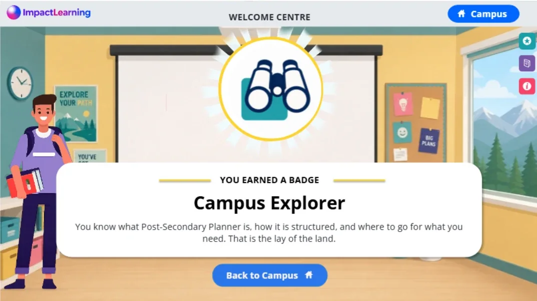
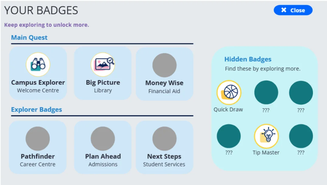
Completing a building earns one of six main badges, like Big Picture, Money Wise and Pathfinder. Six more are hidden and only appear for students who dig deeper, such as Fine Print for reading the details and Tip Master for opening every tip. A badge tracker is always one click away.
Practice that mirrors real decisions
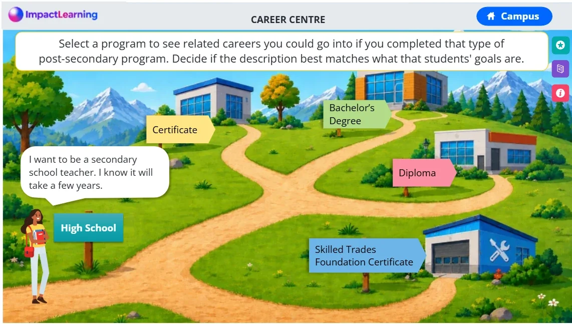
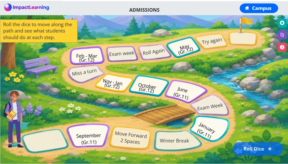
Instead of quizzing students on website features, the activities put them in someone else's shoes: helping characters choose the right credential for their goal, deciding which path fits a career, putting application steps in order, and choosing where on the website they'd go next with a real question.
Making a game accessible
Explorable, visual, game-like courses are where accessibility usually breaks. These are the problems I planned for from the storyboard on, and tested with a keyboard and the NVDA screen reader.
| Challenge | What I did |
|---|---|
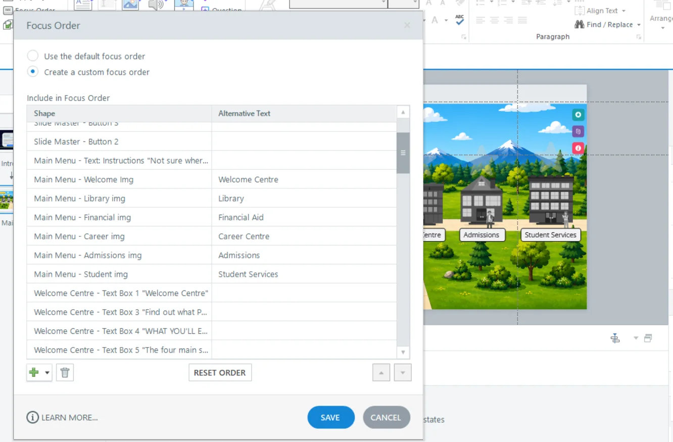
| An illustrated campus map a screen reader can't see | Every building and card is a labelled, focusable object, the focus order follows the visual layout, and decorative scenery is hidden from screen readers. |
| Information packed into visuals | Alt text carries the full meaning, not just a label. The certificate card reads: "Certificate. Typically up to 1 year. Examples: Healthcare Assistant, Early Childhood Education." |
| Drag, sort and match activities | Drag-and-drop is one of the least accessible interactions in Storyline, so I rebuilt every one as a selection-based activity that works the same by mouse, keyboard or screen reader. |
| Narration and video | Closed captions on all narration, plus text alternatives, so no information is audio-only. |
| Game pressure | No time limits, no flashing effects, and feedback never relies on colour alone. Even the Quick Fire Round has no timer: the name just encourages students to trust their instincts. |
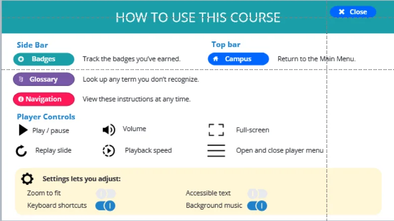
| Background music | A music toggle in the player settings, explained on a "How to use this course" screen along with zoom, accessible text and keyboard shortcuts. |
My process
I designed the campus concept, storyboarded each building and built the whole course in Storyline, using variables to track badges and progress across buildings. After a month of planning and storyboarding, development ran for two months with review cycles along the way.
For the illustrations, I used AI image generation to create base images, then edited each one to fit the course design. That saved the client money and time compared with commissioning custom illustration.
Where it stands
The course hasn't launched yet, so there are no results to report. Instead, I planned how success will be measured before launch, following the learner from the course all the way to the client's website:
- Reaction: an end-of-course survey on relevance, ease of use and confidence.
- Learning: first-attempt accuracy on the scenario activities, and confidence before and after.
- Behaviour: website use by course completers at 30 and 90 days, such as account creation and saved programs.
- Results: fewer "how do I use the website" questions to the support desk and counsellors.
Download the evaluation plan (PDF, 2 pages, 257 KB)
I'll replace the plan's targets with real results once the course launches.